A Social Network Visualization
Python (Pandas, Spotipy) + Gephi
For this short project, I explored the relationships between the Spotify Top 50 playlists in countries around the world through social network analysis. I did this with the goal of better understanding relationships in international musical tastes.
I used Spotify’s API and the Spotipy module to get the top charts for each country where Spotify is available. I cleaned and compiled the data in Python, and used Gephi for analysis and visualization.
This data is from 06/18/20, and the exact relationships below almost certainly do not hold on other days. In the future, I hope to sample more days in order to paint a more complete picture.
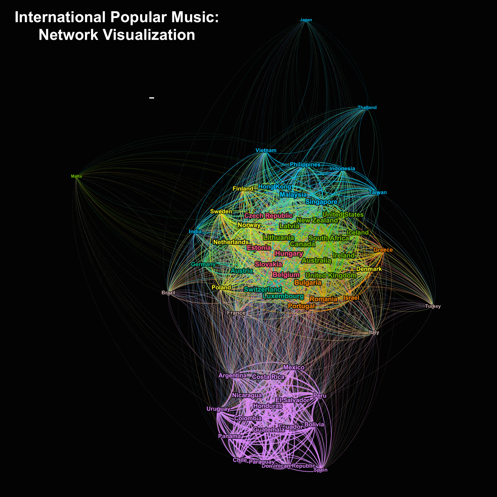
- Each edge (the line connecting two nodes) represents at least one shared song on the two countries’ Spotify Top 50s.
- The thickness of an edge is proportional to the number of songs the two countries had in common, ranging from 1 to 48.
- Text size is proportional to a node’s degree, or number of connections a node has to other nodes.
- Countries that are the same color have been grouped into the same community using Louvain Community Detection. Essentially, these countries have the most in common with each other.
- Those in the spaghetti-like middle are highly connected to other countries. I know its a bit of a mess so I’d appreciate any advice how to clean that up!
Some Take-aways:
- Malta stands out as being unexpectedly dissimilar from other countries. Despite the data being from June, many of its Top 50 were Christmas songs.
- The Spanish-speaking world is extremely musically connected.
- Countries that do not widely use the Latin Alphabet tend to be less connected.
